The study of Rome through architectural themes was an excellent methodology to look at the richness and diversity of the city. It also served as an opportunity to re-examine and further clarify the basic concepts that make architecture. The themes of windows, walls, rooms, courtyards, piazzas and porticos served as the stimulators for investigation and inquiry.
Windows
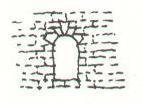
Openings in walls serve two fundamental purposes. They allow light into and order the interior space. Also they give organization to the wall belonging to the street or piazza. The conception of these openings belong to the basic categories with countless variations and combinations.
 |
| 1. Blank windows give scale to the wall of a piazza or street. |
 |
| 2. Punch outs in a plaster wall. |
 |
| 3. Punch outs with partial or full frame added to the surface. |
 |
| 4. Punch out in a surface of scored plaster. Score marks signify spanning and opening. |
 |
| 5. Opening set within and articulated by surface finish of stone. |
 |
| 6. Opening becomes part of a bay organization set between pilasters. |
The ordering of windows on a façade is generally achieved by the regularity of spacing, along with the devices of spring coursing and pilasters.
 |
| 1. Regularity of spacing and opening type. |
 |
2. Opening set on a spring coursing. |
 |
| 3. Pilasters become primary ordering device with windows a part of the bay divisions. |
 |
| Proportion of openings. |
The primary openings generally take on verticle proportions and are of a ratio of 1:2 to 2:3. Secondary or minor openings take on square proportions.
Reprinted from
Bertram Wong
7 September 1982
USC Summer Program in Rome
(all sketches copyright Bertram Wong, no reproduction without permission)
See
(all sketches copyright Bertram Wong, no reproduction without permission)
See
Part 1 - Experiencing the City
Part 2 - Windows
Part 3 - Construction of Walls and Openings
Part 4 - Rooms
Part 5 - Courtyards
Part 6 - Piazzas
Part 7 - Porticos
Part 8 - Conclusions
• One thought on the subject: square and circular windows draw much more attention than they should given their size. I suggest slightly taller than square, and reserve circular for places that are like punctuation points, such as tiny circular windows over entry doors.
ReplyDeleteBruce Donnelly
(from Linkedin Urban Design Network discussion)
• Interesting!
DeleteBuali Adel
(from Linkedin Urban Design Network discussion)